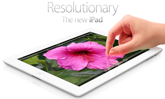
The best part of the IPad3? The Display. After years of waiting for High Resolution Display there are now some movements in the market. Of course this has an important influence on web-development because nobody wants to see washed-out Pictures or even worse: a totally broken design. How am I able to identify a High-Resolution Display? What do I have to take into consideration?
I’m not a full-time Web Designer, so please forgive me if this article isn’t perfect at all ![]() . I’m glad to hear your suggestions in the comments!
. I’m glad to hear your suggestions in the comments!
What’s special about the Retina/High Resolution Displays?
The pixel density is much higher on these Displays so you are able to see pictures with many details. I found this comparison between iPad2 and iPad3 on TheVerge.com

Impressing isn’t it?
High Resolution Pictures on Hi-Res / Retina Displays
At the moment more and more Javascript-libraries appear and their basic structure seems to be geared to Apple. With the introduction of the iPhone 4 Apple published a naming scheme:
Non-Retina-Displays: My-Picture.png
Retina-Displays: [email protected]
The idea is that the framework takes the high resolution pictures automatically if there are some. With that both Retina and Non-Retina-Displays get their chance to shine.
How Apple delivers Pictures for the iPad3 on Apple.com

(Picture from Apple.com)
Of course first of all Apple implemented a support for the iPad3 Display on Apple.com. Here you will find a complete analyze what apple doe’s in detail. In fact it works like this:
-
Usual Apple.com side will be downloaded including the pictures
-
Script check if it’s an iPad with Retina Displays
-
If it’s a Retina Display:
-
For some pictures (for example the main picture on Apple.com) there is a HEAD request for the 2x.png picture (I don’t know why Apple leaved out the “@”)
-
If a picture is found they are going to download it and replace it
If you want to test it for yourself enter this Codes into the Chrome Console:
AC.Retina._devicePixelRatio = 2
new AC.Retina
It needs to be accented that this means a lot of work for the data line because the pictures needs to be downloaded twice and the Retina images are much bigger.
Non-Retina:

Retina-Display:

The Retina Version is three times bigger than the normal size!
Retina-JavaScripts for your own WebApp
Retina.js works almost in the same way and it abides by the naming scheme from the iOS Device (with @2x)

All you have to do is to implement the Script and it will start searching for every img-Tag on the Site and check if there is a Retina Version.
For Background-pictures in CSS there is a .LESS Mixin which creates a Media-Query and deliver the adequate picture. That means Retina Displays get a HighRes Version and non HighRes gadgets get a normal version of the image.
The Code is on GitHUb. Disadvantages on this option: Like on Apple the pictures need to be downloaded twice.
Foresight.js is already working on this problem. The Script should be able to check if it’s a HighRes Display before the actual download of the pictures. There are some Demos but unfortunately you need a HighRes Display (which I don’t have). From the Features only it seems to be a little bit smarter than Retina.js:
· Request hi-res images according to device pixel ratio
· Estimates network connection speed prior to requesting an image
· Allows existing CSS techniques to control an image’s dimensions within the browser
· Implements image-set() CSS to control image resolution variants
· Does not make multiple requests for the same image
· Javascript library and framework independent (ie: jQuery not required)
· Image dimensions set by percents will scale to the parent element’s available width
· Default images will load without javascript enabled
· Does not use device detection through user-agents
· Minifies to 7K
Loading pages for Websites again soon? When High-Res doesn’t make fun at all….</strong>
On the one hand its grate if every website tries to shine with High-Resolution Pictures because clear and defined pictures make fun but if you don’t own a fast internet connection or if you try to surf on the way it could be very annoying. At the moment you can get UMTS everywhere but there is always a data limit and the Provider manipulate the web to save Bytes. If you are forced to see waiting pages before you are able to enter the website (like it happens with Flash in the past)?
SVGs, Icon-Fronts & Responsive Designs
I’ve only spoken about pictures so far but of course there are many subjects left. One subject is how to deal with Icons – maybe Icon-Fonts are an interesting subject. The issue Responsive Design and SVGs plays an important role as well – for this topic I found an interesting Blogpost.
Will there be HighRes Displays for Windows as well and experiences with Web-development with HighRes Images?
Even though I’ve wrote about High-Res displays all the time the only one I know is the iPad 3 display. Does somebody know another one? Or will there be an upgrade with Windows 8? If you own a Mac (and an iPad3) you are able to use it as a High-Res display. If you know alternatives in the world of Windows please tell me ![]() Do you know somebody who is already providing special pictures for the iPad3?
Do you know somebody who is already providing special pictures for the iPad3?
By the way: If you think about getting an iPad3 you are welcome to do it via this Amazon link and support our work ![]()