HTML and CSS are not foreign words for me but I regret, I’m not a Web designer - I see myself as a webdeveloper. But at least a dressy side is a must. But thank good there are some ready “Systems”.
Twitter Bootstrap
Twitter Bootstrap is a Toolkit for every kind of Web applications. It includes some basic styles and also some special styles for Buttons, charts, forms and so on. After all it is a smart Grid-System. Compared to other CSS Grid Frameworks Twitter Bootstrap seems to be more “round” and it offers some basic elements.
The best way is to take a look online. You will find a source on GitHub.
Technics behind it
Twitter Bootstrap is using Less to build the CSS and it also contains ready Javascripts for some little UI gimmicks like Popups, Dropdowns, Dialogs, …
The embedding
All you have to do is to embed the Styles (the Less files plus the Less Javascript files or the ready CSS). An example which you will also found on the GitHub examples:
<!DOCTYPE html>
<html lang="en">
<head>
<meta charset="utf-8">
<title>Bootstrap, from Twitter</title>
<meta name="description" content="">
<meta name="author" content="">
<!-- Le HTML5 shim, for IE6-8 support of HTML elements -->
<!--[if lt IE 9]>
<script src="http://html5shim.googlecode.com/svn/trunk/html5.js"></script>
<![endif]-->
<!-- Le styles -->
<link href="../bootstrap.css" rel="stylesheet">
<style type="text/css">
/* Override some defaults */
html, body {
background-color: #eee;
}
body {
padding-top: 40px; /* 40px to make the container go all the way to the bottom of the topbar */
}
.container > footer p {
text-align: center; /* center align it with the container */
}
.container {
width: 820px; /* downsize our container to make the content feel a bit tighter and more cohesive. NOTE: this removes two full columns from the grid, meaning you only go to 14 columns and not 16. */
}
/* The white background content wrapper */
.content {
background-color: #fff;
padding: 20px;
margin: 0 -20px; /* negative indent the amount of the padding to maintain the grid system */
-webkit-border-radius: 0 0 6px 6px;
-moz-border-radius: 0 0 6px 6px;
border-radius: 0 0 6px 6px;
-webkit-box-shadow: 0 1px 2px rgba(0,0,0,.15);
-moz-box-shadow: 0 1px 2px rgba(0,0,0,.15);
box-shadow: 0 1px 2px rgba(0,0,0,.15);
}
/* Page header tweaks */
.page-header {
background-color: #f5f5f5;
padding: 20px 20px 10px;
margin: -20px -20px 20px;
}
/* Styles you shouldn't keep as they are for displaying this base example only */
.content .span10,
.content .span4 {
min-height: 500px;
}
/* Give a quick and non-cross-browser friendly divider */
.content .span4 {
margin-left: 0;
padding-left: 19px;
border-left: 1px solid #eee;
}
.topbar .btn {
border: 0;
}
</style>
<!-- Le fav and touch icons -->
<link rel="shortcut icon" href="images/favicon.ico">
<link rel="apple-touch-icon" href="images/apple-touch-icon.png">
<link rel="apple-touch-icon" sizes="72x72" href="images/apple-touch-icon-72x72.png">
<link rel="apple-touch-icon" sizes="114x114" href="images/apple-touch-icon-114x114.png">
</head>
<body>
<div class="topbar">
<div class="fill">
<div class="container">
<a class="brand" href="#">Project name</a>
<ul class="nav">
<li class="active"><a href="#">Home</a></li>
<li><a href="#about">About</a></li>
<li><a href="#contact">Contact</a></li>
</ul>
<form action="" class="pull-right">
<input class="input-small" type="text" placeholder="Username">
<input class="input-small" type="password" placeholder="Password">
<button class="btn" type="submit">Sign in</button>
</form>
</div>
</div>
</div>
<div class="container">
<div class="content">
<div class="page-header">
<h1>Page name <small>Supporting text or tagline</small></h1>
</div>
<div class="row">
<div class="span10">
<h2>Main content</h2>
</div>
<div class="span4">
<h3>Secondary content</h3>
</div>
</div>
</div>
<footer>
<p>© Company 2011</p>
</footer>
</div> <!-- /container -->
</body>
</html>
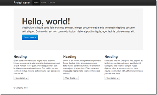
It creates this side:
Roadmap
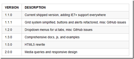
There is also a Roadmap for this Project which is cultivated by some developers on Twitter:
Result
Twitter Bootstrap seems to be a great entrance for non-designer with many nice elements. The only think I’ve missed is a version for Mobile websites – I’m looking forward to it.
Download and everything else on GitHub.

